Paint the Party: A Host's Guide to Using Color Like a Pro
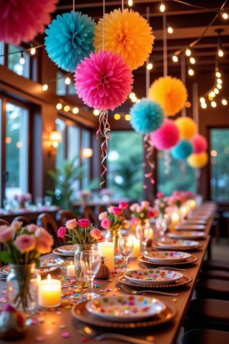
Photo: colorful party decoration setup with balloons table settings and mood lighting, via i.pinimg.com
You've spent hours curating the playlist. The food is dialed in. But there's one design decision that's quietly doing more emotional heavy lifting than almost anything else at your party — and most hosts barely think about it. Color. The palette you choose for your celebration doesn't just look pretty. It actively shapes how your guests feel the moment they walk through the door, how much they talk, how much they eat, and how long they linger.
This isn't woo-woo stuff. Color psychology is a well-documented field, and its principles apply directly to event design in ways that are both practical and genuinely game-changing once you understand them.
The Basics: Warm vs. Cool and Why It Matters
Every color on the spectrum falls into one of two broad emotional camps, and understanding this is your foundation.
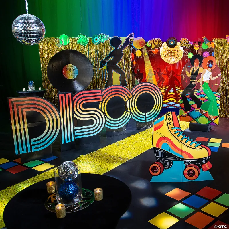
Warm colors — reds, oranges, yellows, and their various blends — are stimulating. They increase heart rate, encourage conversation, and create a sense of energy and excitement. This is why fast food chains have leaned on red and yellow for decades. In a party context, warm palettes work beautifully for celebrations where you want high energy: birthday parties, engagement parties, graduation bashes, Fourth of July cookouts.
Cool colors — blues, greens, purples, and soft neutrals — have the opposite effect. They lower perceived temperature, slow the heart rate slightly, and create feelings of calm, trust, and intimacy. These are your go-to hues for dinner parties, bridal showers, retirement celebrations, and any event where you want guests to feel relaxed and connected rather than amped up.
Neither category is better. The goal is matching your palette to the feeling you want to create — and that's a decision only you can make based on the occasion and your guests.
Specific Colors and Their Party Superpowers
Let's get specific, because the difference between a deep burgundy and a bright cherry red is enormous in terms of emotional effect.
Red in its bold, saturated form is passionate and high-energy — ideal for New Year's Eve, Valentine's Day, or a lively cocktail party. Softer, deeper reds like burgundy or wine feel sophisticated and warm, perfect for fall gatherings and holiday dinners.
Yellow is the most psychologically complex color on the spectrum. At the right intensity — think golden, honey, or warm amber — it reads as joyful, optimistic, and welcoming. Push it too bright or too saturated, and it can actually cause anxiety. For parties, lean toward muted or golden yellows rather than neon.
Orange is criminally underused in party design. It combines the energy of red with the cheerfulness of yellow and reads as friendly, fun, and approachable. It's a natural fit for fall celebrations, kids' parties, and any event where you want a laid-back, festive vibe without the intensity of red.
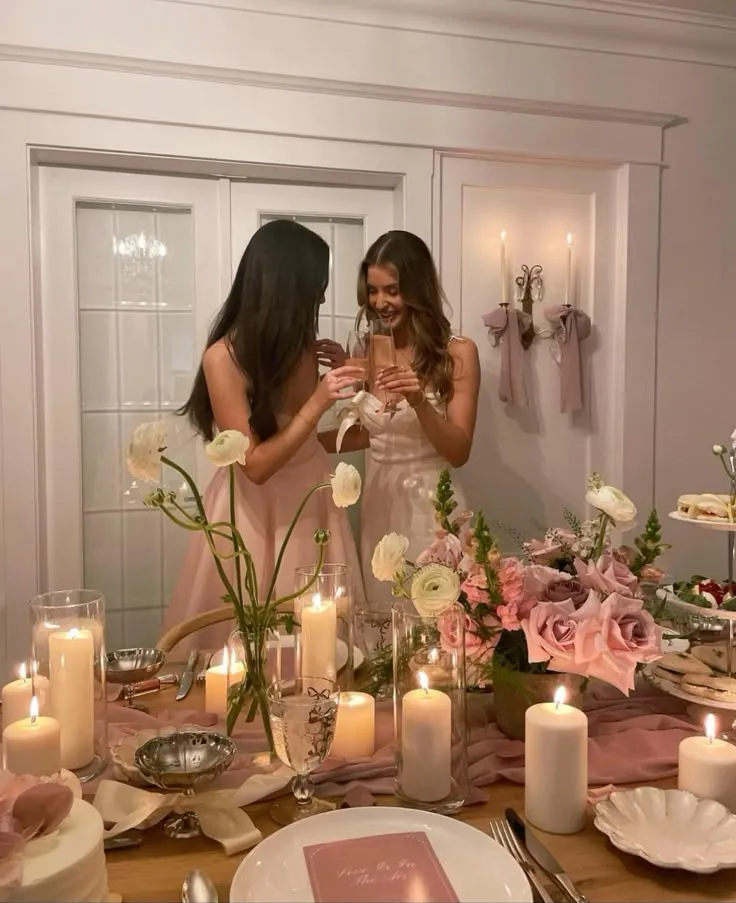
Blue is the world's most universally liked color, and it brings a sense of calm and reliability to your space. Pale, soft blues create a dreamy, ethereal quality great for baby showers and bridal events. Navy or deep cobalt adds sophistication and pairs beautifully with gold for elegant evening affairs.
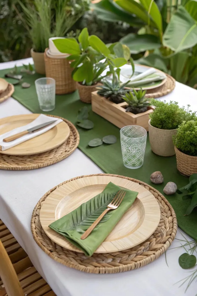
Green signals renewal, freshness, and a connection to nature. It's a surprisingly versatile party color — sage green has become a major trend in wedding and shower design because it feels organic and effortlessly stylish. Brighter greens bring playful energy, while deep forest greens feel rich and luxurious.
Purple walks a fascinating line between the energy of red and the calm of blue. Lavender and lilac are soft and whimsical, ideal for garden parties and children's events. Deep plum or violet reads as opulent and dramatic, elevating formal celebrations.
White and neutrals deserve their own mention because they do something specific: they create breathing room. In a heavily decorated space, white acts as a reset button for the eye, allowing other colors to pop and preventing visual overwhelm.
How Lighting Changes Everything
Here's a critical piece of the puzzle that even experienced hosts overlook: lighting completely transforms how colors read in a space. That dusty rose tablecloth that looked perfect in your living room at 2pm might look washed out under fluorescent venue lighting or dramatically different under string lights at dusk.
Warm-toned lighting (think Edison bulbs, candlelight, string lights) enhances warm colors and makes cool colors feel cozier. Cool-toned or white lighting tends to make cool colors pop and can flatten warm ones. If you're hosting an outdoor evening event, test how your decorations look in both daylight and artificial light before committing.
Colored lighting is a powerful tool in its own right. Soft pink or amber uplighting can make almost any space feel instantly more glamorous and flattering. Blue uplighting creates a cool, dramatic effect. Even something as simple as candles in colored glass votives adds a layer of atmospheric color that photographs beautifully and shifts the entire mood of the room.
Unexpected Pairings That Create Memorable Events
The most forgettable parties are the ones that play it safe with color. You've seen a thousand blush-and-gold bridal showers. You remember the one that used deep teal and terracotta. Unexpected color pairings create a distinct visual identity that guests associate with that specific celebration — which is exactly what you want.
Some combinations worth experimenting with:
- Mustard yellow + dusty blue: Retro, cheerful, and surprisingly sophisticated. Great for casual birthday parties or outdoor summer gatherings.
- Coral + sage green: Feels fresh, modern, and slightly bohemian. Perfect for spring and summer events.
- Deep burgundy + blush pink: Rich and romantic without being predictable. Works beautifully for intimate dinner parties and milestone anniversaries.
- Black + chartreuse: Bold and graphic. Ideal for cocktail parties and New Year's Eve events where you want a high-fashion edge.
- Terracotta + cream + rust: Warm, earthy, and incredibly on-trend for fall celebrations and casual backyard parties.
A Quick Guide by Party Type
Not sure where to start? Here's a cheat sheet:
- Kids' birthday parties: Bright, saturated primaries or rainbow palettes. High energy, pure joy.
- Bridal showers and baby showers: Soft pastels, sage, blush, lavender. Gentle and celebratory.
- Milestone birthdays (40+): Rich jewel tones, navy and gold, or sophisticated neutrals. Elevated and intentional.
- Holiday parties: Lean into seasonal palettes — cranberry and gold for Christmas, navy and silver for winter themes, warm amber and brown for Thanksgiving.
- Cocktail and dinner parties: Deep, moody tones — forest green, burgundy, navy — create intimacy and encourage lingering conversation.
Color is one of the most powerful — and most underestimated — tools in a party planner's kit. At Sherry's Party Design, we believe that every celebration deserves a palette as intentional as the guest list. When you understand what your colors are doing to the people in the room, you stop decorating by accident and start designing with purpose. And that's when the real magic happens.